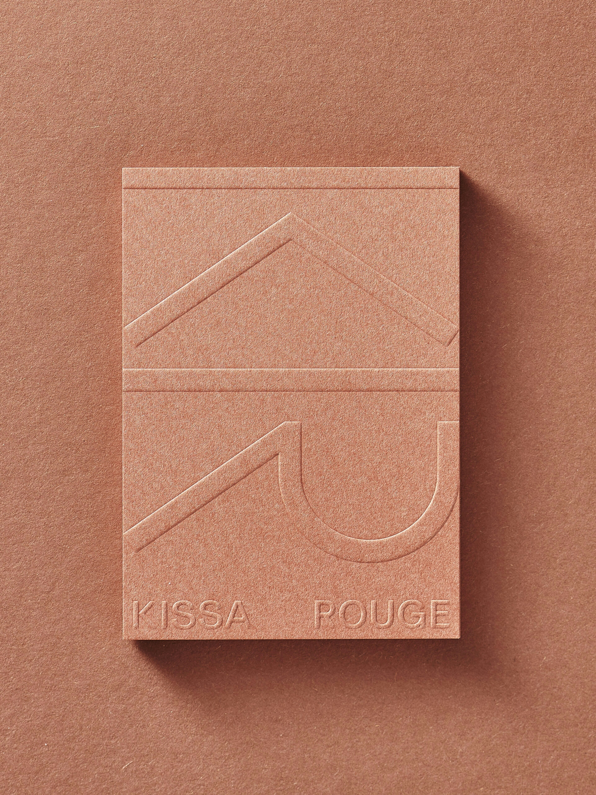
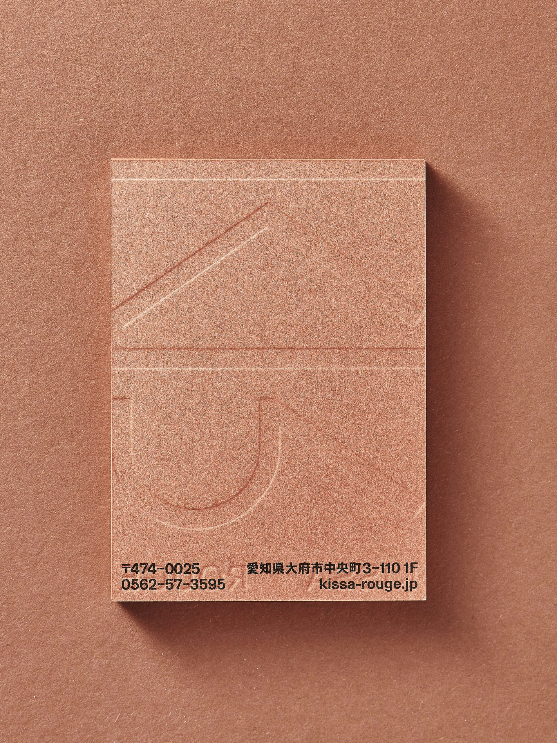
Visual identity design for a Japanese kissaten (coffee house) in Oobu, Nagoya. Classic kissaten contain both Japanese and European elements, which are referenced in the design of the KR symbol. Although consisting of two roman letters, the loosely grouped strokes form a unified symbol that resembles a kanji character. The simple and elegant interior, designed by Flooat, consists of carefully selected materials and furniture.
Visual Identity
Description
Shop card with blind embossing
Dimensions
75 x 105 mm
Technique
Embossing, Offset Print
Photo Credit
Michael Fehr
Digital
Description
motion logo
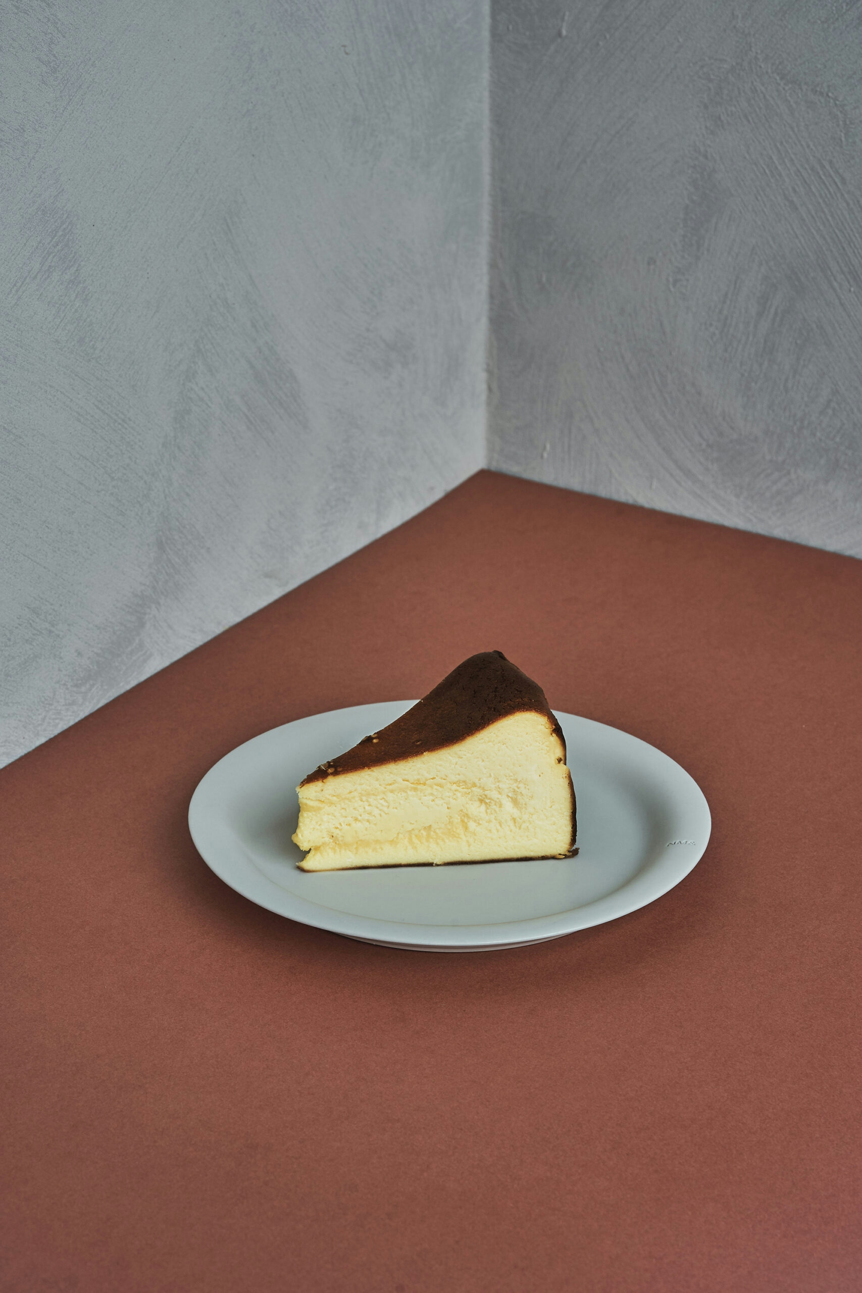
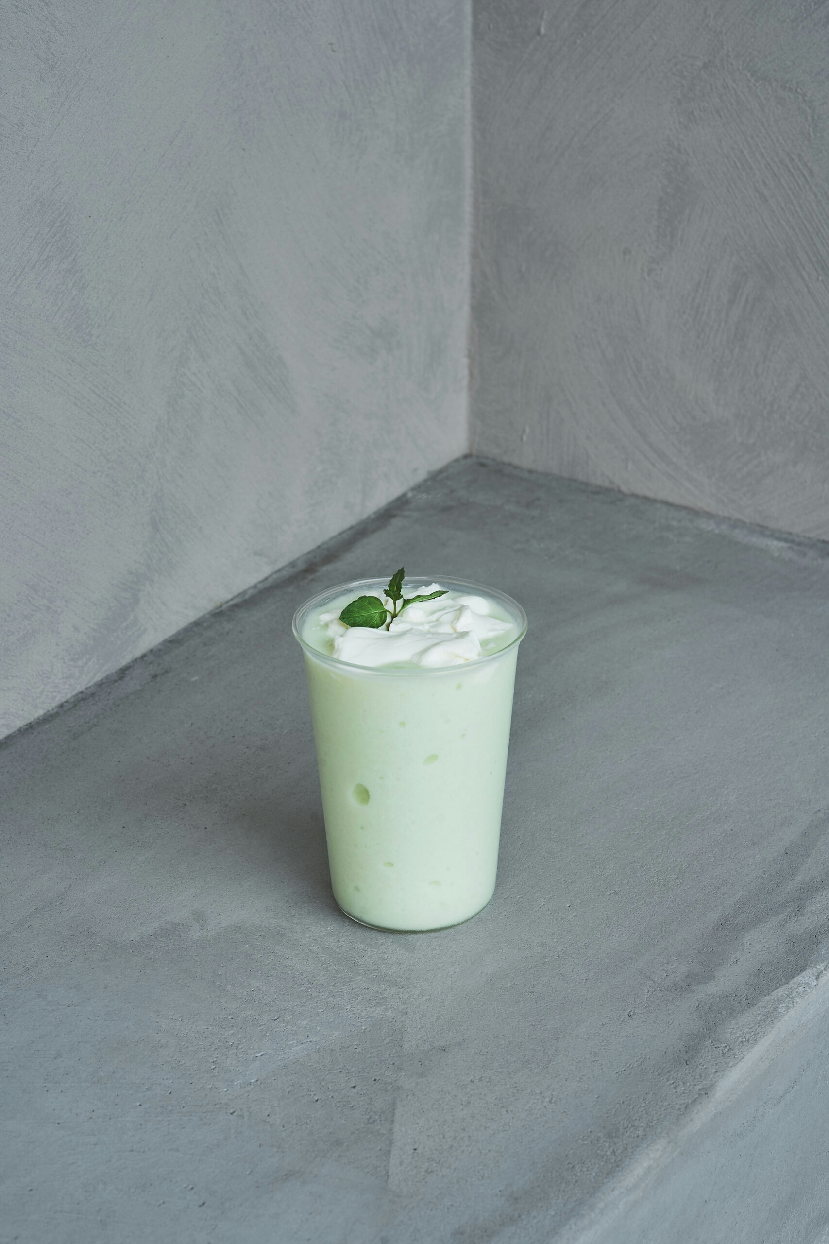
Communication
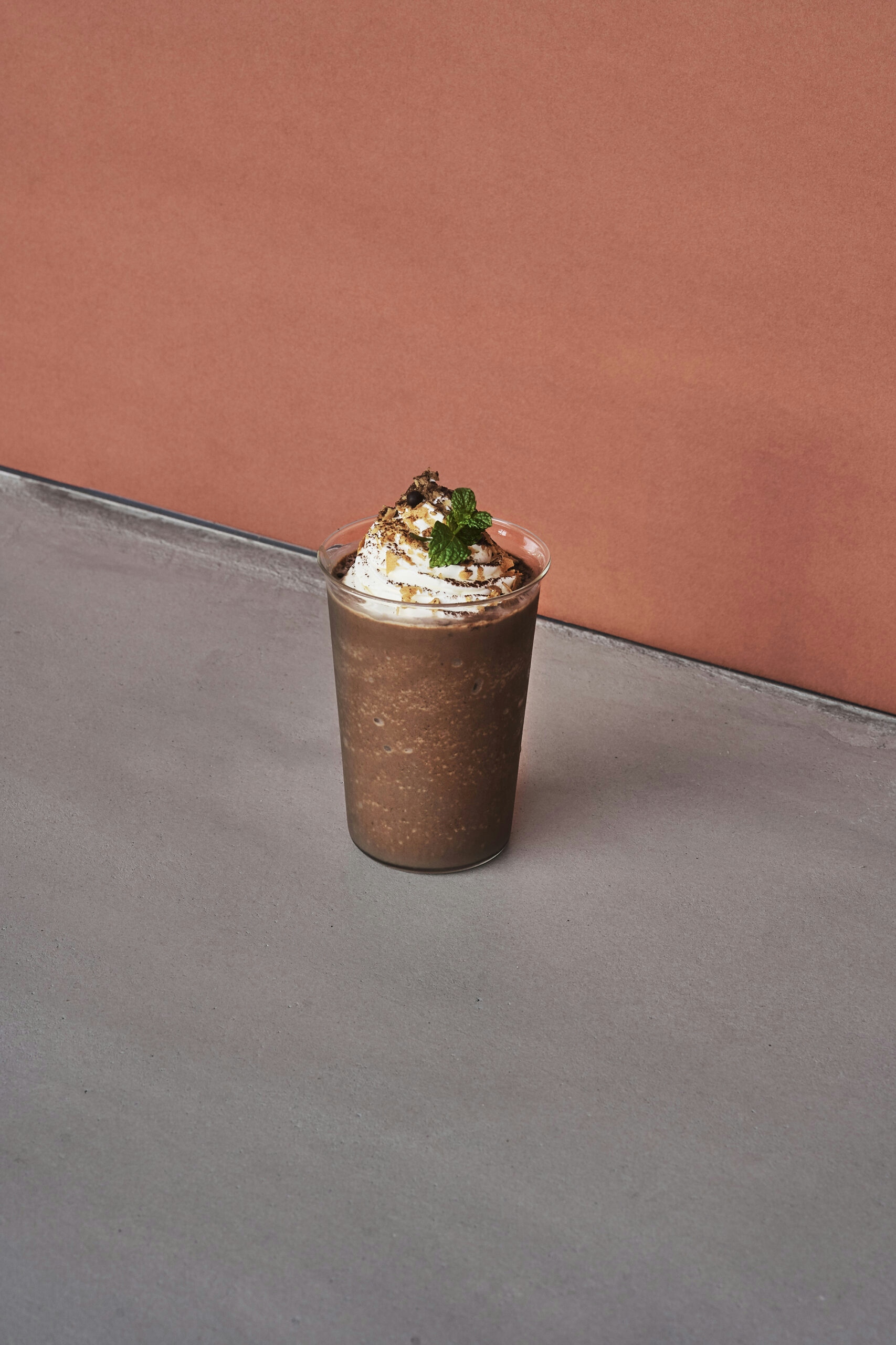
Description
art direction of photo shooting for menu and shop visuals
Photo Credit
Masaaki Inoue / BOUILLON
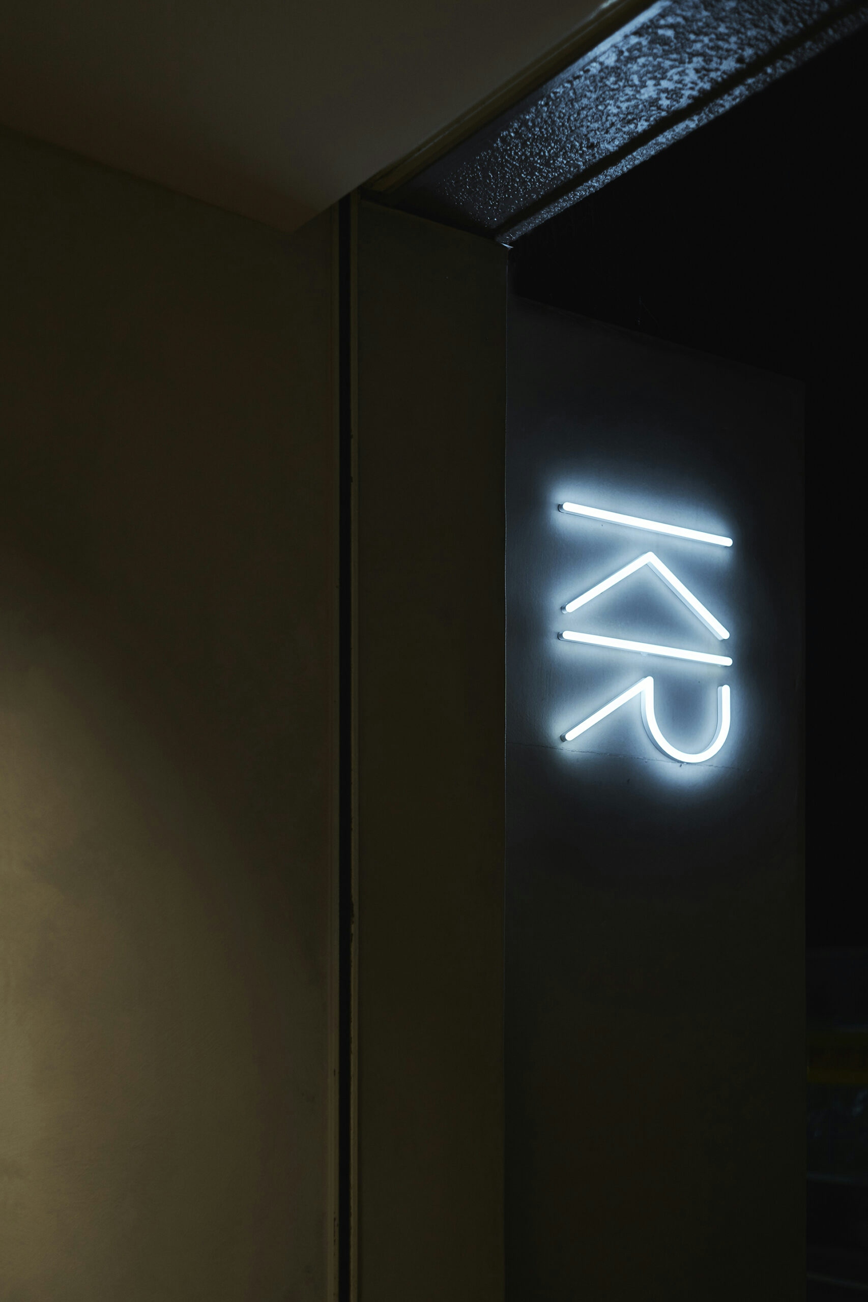
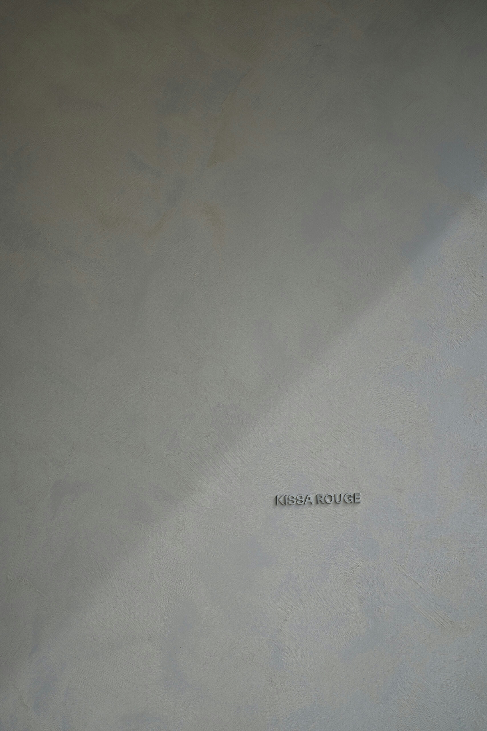
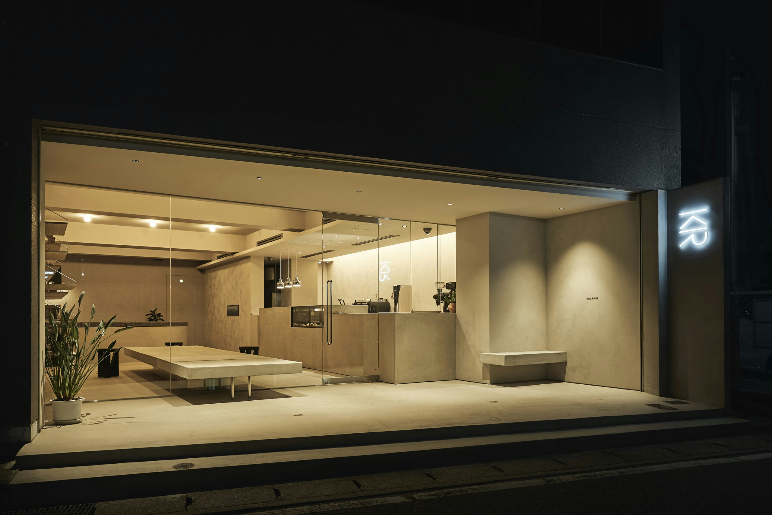
Signage
Description
signage design in collaboration with Flooat inc.
Dimensions
various
Photo Credit
Masaaki Inoue / BOUILLON
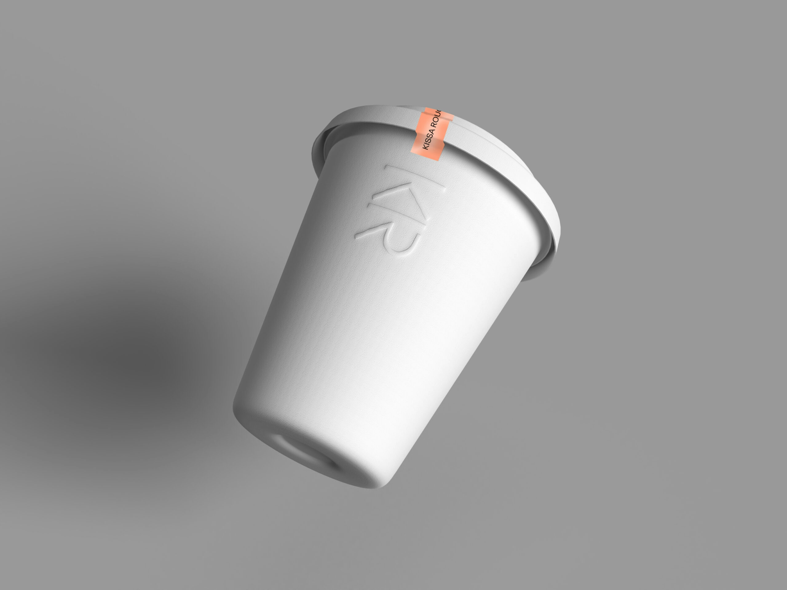
Package
Description
study for a molded paper cup